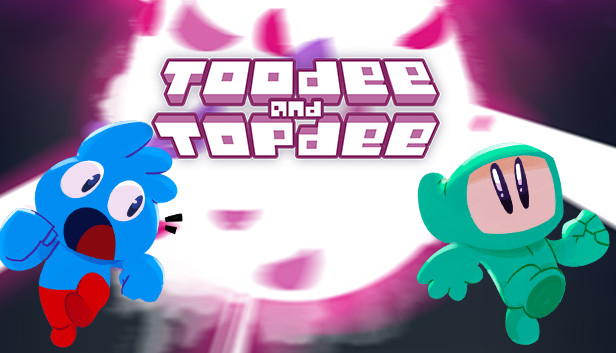
Toodee and Topdee
Interesting puzzle concept. But the control scheme is totally ducked up. And the tight-timing platform/action aspect is just not mixed well with the big-brain complex puzzle theme.
Most of the time I died because I want to <jump/grab>, but I hit the <switch> button, and vice versa. At first I thought this was my fault alone. But after playing a very first few chapters, I realize that this game don’t require <jump/grab> nor <switch> so much (unlike other platformer games that I have to perform jump like 100 times a level). The issue worsen with the location of the buttons which is so close, [Z]/[X] on keyboard, or [X]/[A] on controller (why not [SPACE]/[TAB] and [A]/[LT/RT] instead?). Thus I have a hard time develop muscle memory of the correct buttons. When we actually need to pull it off (keep in mind that there’re monsters chasing you at high speed), it’s so easy to messed up.
The button issue goes deep down than that. You see, the only action each character can do is jump or grab, exclusively. Initially, it might be a logical assumption to put both actions onto one button <jump/grab>, since when you are toodee you cannot grab, and when you are topdee you cannot jump. In practice, this design became a fatal mistake instead. For example, when the player is concentrating control toodee doing the platforming section, but need to switch to topdee for a sec, it is counter-intuitive to use the same button with topdee to perform a grab – since many other game does separate these buttons. So if the player doesn’t press that button but press another one out of the habit, it is a <swap> button instead! Now the player is given back to control toodee again, and immediately fall to their death because topdee forget to grab a box and build a platform… This problem will less likely to occur if the omni-action button was separate into two dedicated buttons in the first place.
Remember that we are talking about a game that combine puzzle and platforming that every decision happen in a split second (if the game is not a platforming but just only a slow puzzle, then this design is more forgivable). So the buttons must be super clear in the first place. Each button should do one job and one job only. Not this messed up that not only confusing but also not allow any margin of error!
The boss is also annoying, why our characters have only 1 heart by default? That’s hardly fun to observe boss patterns. And the patterns is so darn long. Each time I died at a boss fight, I have to repeat the process of dodging attack like half a minutes before I can even land a first hit on the boss. And the boss needed to be hit three times in total! With the almost the same moveset!! What a wasted time of my life doing something so boring, so tedious.
Know your audience. In fact, see the stat. I wonder how many people would turn on the infinite life and just play the game just for the puzzle alone.
Originally published on: Steam

author

